RSI (Relative Strength Index) is probably one of the most well-known indicators on the market! It is however often misused, and individual traders often only look at oversold and overbought areas. Let us learn together how to read this indicator that can indeed be very useful!
RSI crypto market indicator – Theory
RSI: definition
The RSI (Relative Strenght Index) is an indicator that is part of the “oscillator” type. It was developed in the late ’70s by J. Wilder. After shining for several years on the market as a trader, he decided to summarize his research and knowledge. He therefore created a series of indicators with the goal of facilitating the way that actors approach a market. The RSI is one of these indicators.
How does this RSI trading indicator work?
By default, the RSI measures a variation over 14 periods of a time unit.
For example: 14 days if you choose the Daily time unit, 14 hours if you use H1, etc…
You can also change this number in order to have a more precise indicator, or on the contrary a longer one.
The formula for this indicator is simple: average price increase during this period / average decrease over this same period.
It then places this ratio on a scale from 1 to 100.
RSI crypto market indicator – Practice
The question we can now ask is the following: how can you use this indicator in your daily trading strategy? We will go through this step by step, from its most basic use to its more advanced!
Overbought and oversold areas
The most basic reading of the RSI consists in determining whether an asset is overbought or oversold, and this interpretation is rather simple:
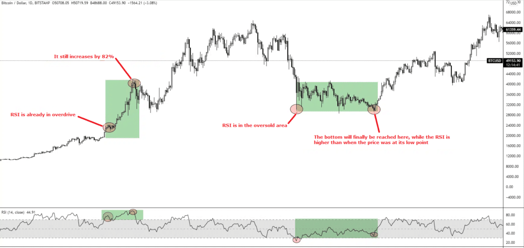
→ If the RSI is above 65 to 70, we are in overbought conditions
→ If the RSI is below 30 to 35, we are in oversold conditions
You might be tempted to think the following:
If it’s high, I am selling!
If it’s low, I am buying!
Of course, it is not as simple as that. The RSI can reach overbought areas and go very high, before a correction period or a selling signal happens. It’s all in the dosage.
Like any other indicator, the RSI should be combined with many other pieces of data like Price Action (study of the action of the price), Open Interest (interest used to open leverage positions), Funding Rates (difference between spot price and futures price)…
We will study these notions in detail in an upcoming article. The magical indicator does not exist, each indicator is to be put in a context in order to maximize its chances of success and, as a consequence, maximize profits. Always wait for several signals to align before making a decision.
The neutral area
Personally, the neutral area is the one I use the most in my technical analyses. Indeed, market actors like to look at oversold and overbought areas, but there is an extremely important element in between the two, called the neutral area.
The neutral area is reached after going through an overbought or oversold area.
Let us take our chart again and imagine that we missed the train that has just gone by for Bitcoin (BTC). We are good traders and will patiently wait for a retracement before making a purchase.
The neutral area is interesting to keep an eye on as it can indicate the end of a correction period, as well as an excellent point of entry; let’s have another look at the chart.
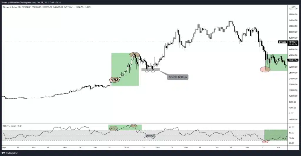
The most neutral area of the RSI, the 50 mark, maintained itself very well, and it reflected on the price that went through a continuation of the bullish trend observed; this was an excellent point of entry.
The 50 mark of the RSI is an important level. Here is another chart that will illustrate the importance of this threshold.
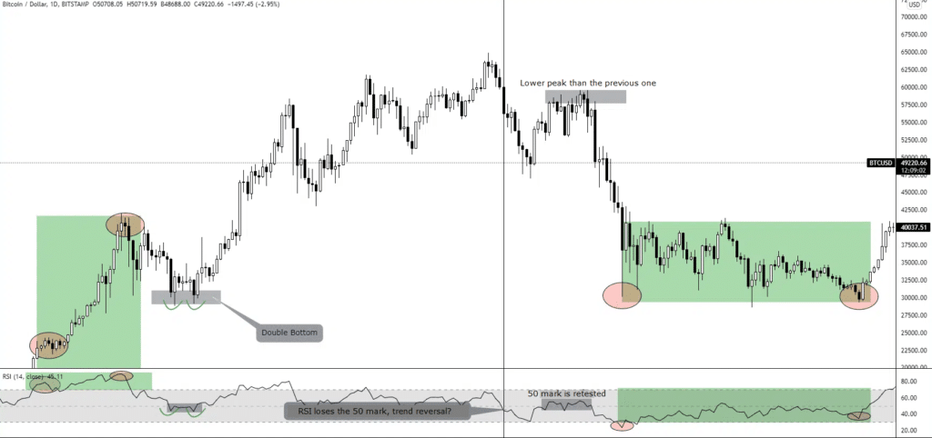
Here we can see that the 50 mark was lost, and we entered the oversold area. The price bounced back, reach a lower peak than the previous one, and the RSI retested the 50 mark. It failed to get over it, then an important bearish trend started: this was a sell signal!
Divergences
A divergence occurs when a technical indicator does not follow the peaks and troughs that the price makes.
Example of a divergence
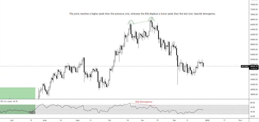
Here, the price of Bitcoin climbed to a higher peak than the previous one, whereas the RSI did not go as high as its previous peak; this is therefore a bearish divergence. It was a sell signal, after which the price of Bitcoin went through a brutal correction period.
Let us now zoom in with a 4-hour time unit on this movement:
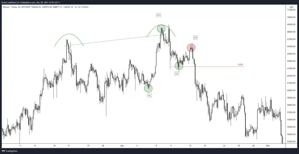
Price action can be used to confirm this bearish divergence. The market went back on a bullish trend at H4, reaching peaks and troughs that go higher and higher (HH = Higher High = Higher peak than the previous one, HL = Higher Low = Higher peak than the previous one, bullish trend). The HH was followed by an engulfing candle, hinting at a market reversal.
Then, an LH appeared (Lower High = Peak lower than the previous one), indicating a diminished buying enthusiasm, and, by extension, a sign that sellers had the upper hand. The MSB line stands for Market Structure Break. This is the line that, when broken, shows that the market structure has also been overturned in a bearish trend.
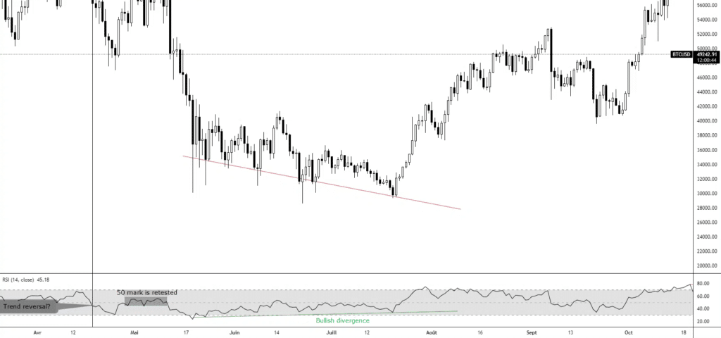
Here, on the contrary, the price marked lower and lower troughs, whereas the RSI went through higher and higher troughs, indicating a bullish divergence. This was followed by a price increase, confirming this divergence.
Case studies
I mentioned earlier that you should always combine an indicator with several other elements, let us now see how it can be implemented to a strategy!
Case study n°1: Technical analysis of Ethereum
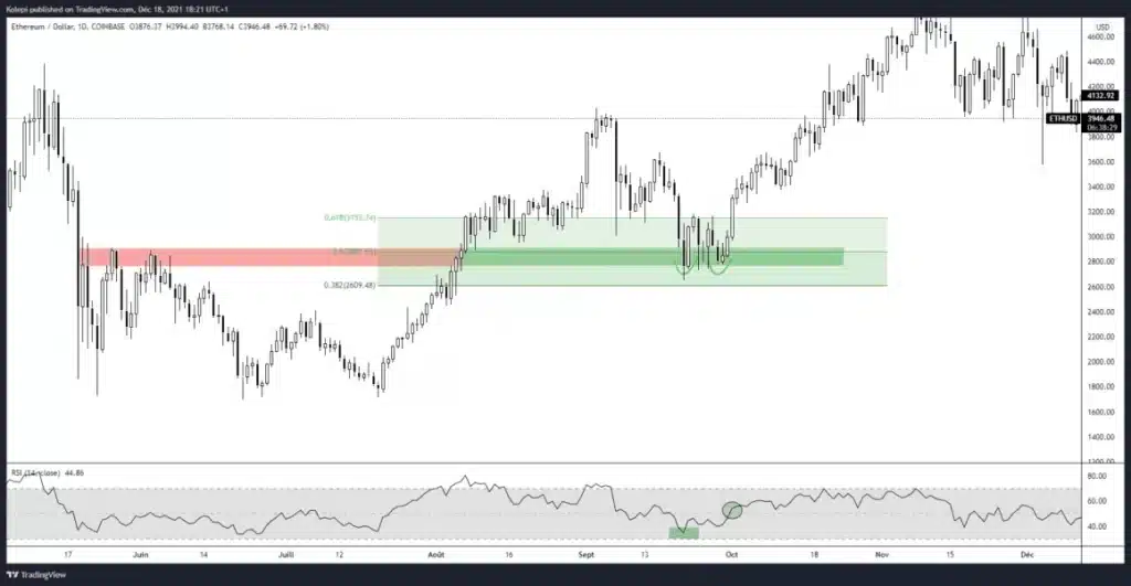
Here we have the chart for Ethereum (ETH). To begin with, we can see that the $2,800 mark previously represented a resistance, which makes it an area of interest. This mark is not insignificant as it corresponds to another important level called Fibonacci 0.5. This area reacted very well twice as support, i.e. a double bottom, which indicates that sellers failed twice in a row. Lastly, the RSI confirms our analysis with a crossover from bottom to top, a sign of a bullish trend.
Case study n°2: Technical analysis of Bitcoin
We are now looking at the chart for Bitcoin in July of 2021. After a long and painful bearish trend, a daily engulfing appears, indicating a reversal, and the RSI crosses the 50 mark after its bullish divergence. Several signals are strong and the buying enthusiasm is confirmed to go back up: the price follows a bullish trend. As a trader, your goal is to find converging signals that feed into your strategy; we have a good example of this here.
Conclusion on the RSI technical indicator in crypto
The RSI can reveal itself to be very relevant. However, as is the case for every indicator, it is to be combined with multiple pieces of information, Price Action, on-chain data, Open Interest, and Funding Rate for instance. In addition to this, keep in mind that the different possible ways to read this indicator can make it tricky to interpret. You will probably need some time before integrating it into your trading strategy, but it might eventually find a prevalent place in your technical analyses.
Always look for several confirmations, such as a specific Japanese candlestick pattern or the validation of a reversal structure, in order to maximize your chances of success.